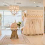
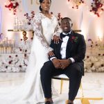
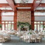
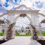
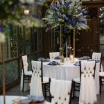
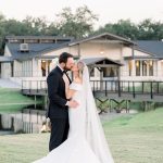
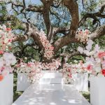
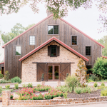
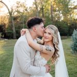
One of the major concerns many couples have when planning a wedding is creating a cohesive wedding look. Taking all the ideas that are swirling around in your mind (and your Pinterest boards!) and creating a beautiful, unified design can feel like an impossible task. We asked Skylar Caitlin with Chancey Charm Weddings to share a few tricks of the trade she’s learned as a designer that won’t require years of experience to implement into your own wedding plans. Read on!
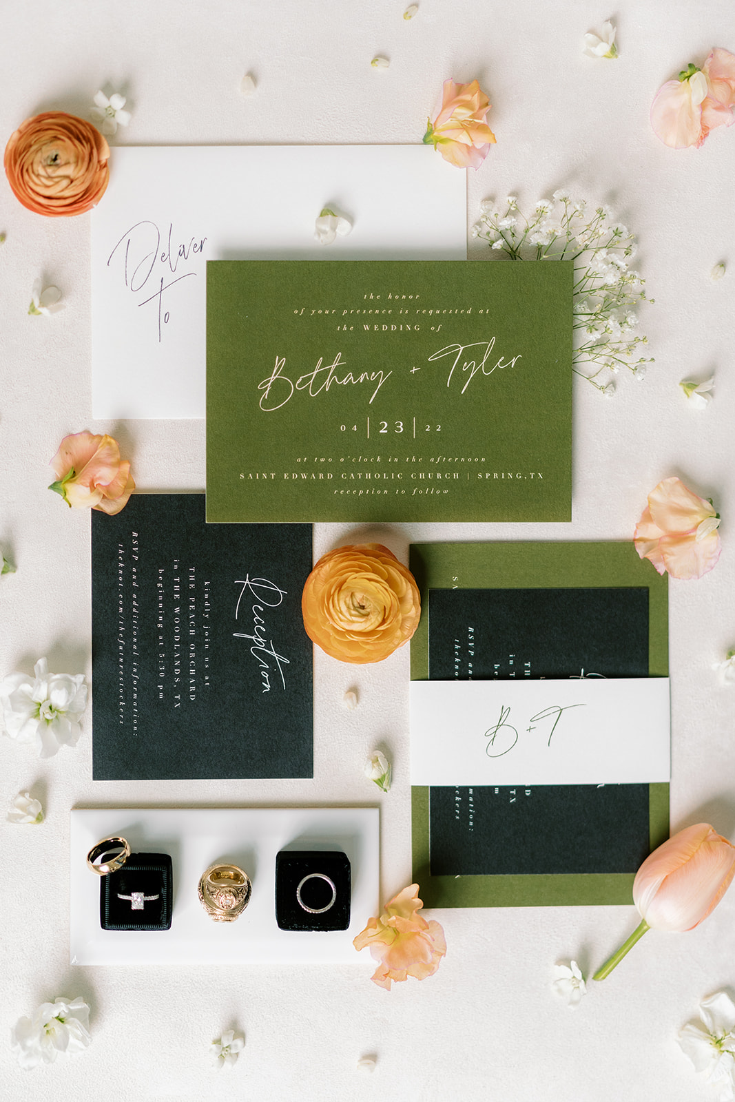
Photo: Alicia Yarrish Photography
Tip 1: Select a Strong Color Palette
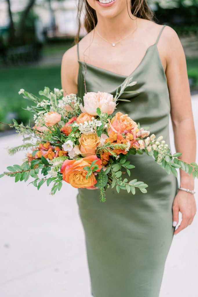
Strategic color decisions have always been a way couples unified their wedding look. However, a refined, elegant wedding requires a bit more color nuance than slapping the same 2-3 main colors on anything that isn’t moving.
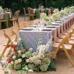
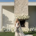
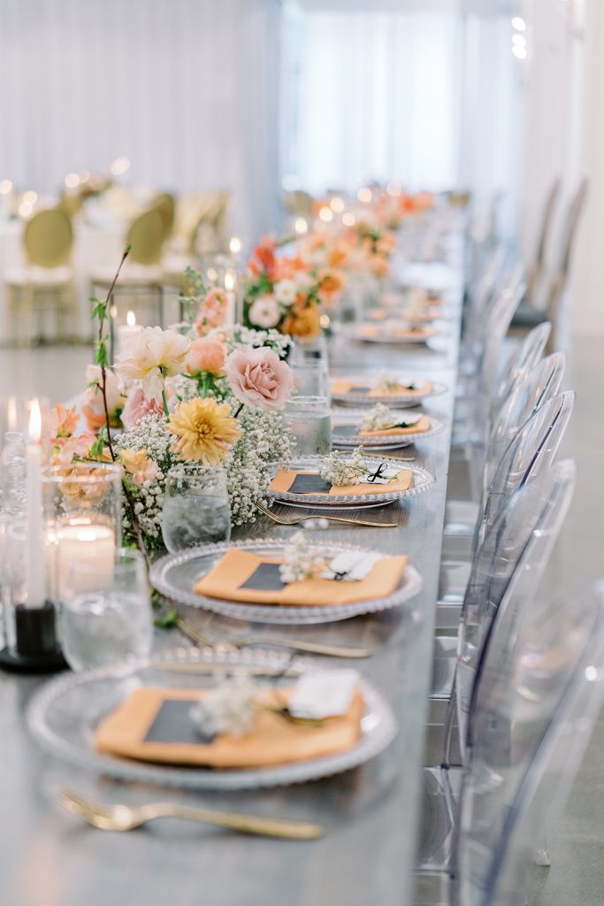
Creating a cohesive and stunning wedding palette requires variation. Even if you want an all-white wedding, there are so many variations of white (cream, ivory, pearl, bone, parchment, eggshell, etc., etc.). Using multiple shades of the same color will create depth in your designs and ensure your color usage looks more natural.
Think about a cluster of flowers. They are rarely exactly the same shade throughout all the flowers (or even every individual flower). Because we’re used to the variation found in nature, using variation of colors in your wedding palette will make your color selections feel more natural and elevated.
Tip 2: Remain Consistent in Formality Level
Imagine you receive a gorgeous calligraphed invitation to a formal event. You are greeted by champagne at the valet station and walk a red carpet into the reception. You sit down at your table and they have plastic utensils laid out for you to use. Suddenly the event feels off – as if this was a mistake or, worse, something that was forgotten about until the day-of when this was the only option left.
While there is nothing inherently wrong with using plastic utensils at your wedding, this somewhat exaggerated example illustrates how inconsistent formality levels create a cognitive dissonance for your guests and leaves your event feeling fragmented instead of cohesive.
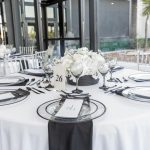
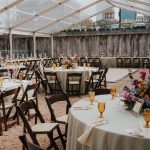
If you’re feeling stuck, use your dress code as a guide. While open seating may feel natural for a cocktail reception, for a black-tie event escort cards (and perhaps even place cards) match the formality level and develop a more cohesive wedding look and experience for your guests.
Tip 3: Lean on a Motif
Just like a strong (and multi-shaded) color palette can create a harmonious wedding look, so can a motif. A motif is a noticeable element that typically appears throughout a piece of art, literature, film, or music. It’s often used as a device to further the story or communicate an underlying message in the work. I like to think of a motif as the high-society version of a theme.
I had an industry friend recently who created a custom pattern with her stationer. She then used this pattern not only in her invitations, but on the ribbon around her bouquet, on custom table linens, on a wall backdrop, and even in a pre-wedding dress she wore to her luncheon. Talk about a cohesive vision!
This is a great example of taking a subtle, but identifiable element and peppering it through your wedding day to create a cohesive wedding look. Cohesion often isn’t about pounding guests over the head with an idea, but rather gently weaving aligned items together leaving guests with a feeling of unified design that they can’t quite put their finger on why it works, they just know that it does.
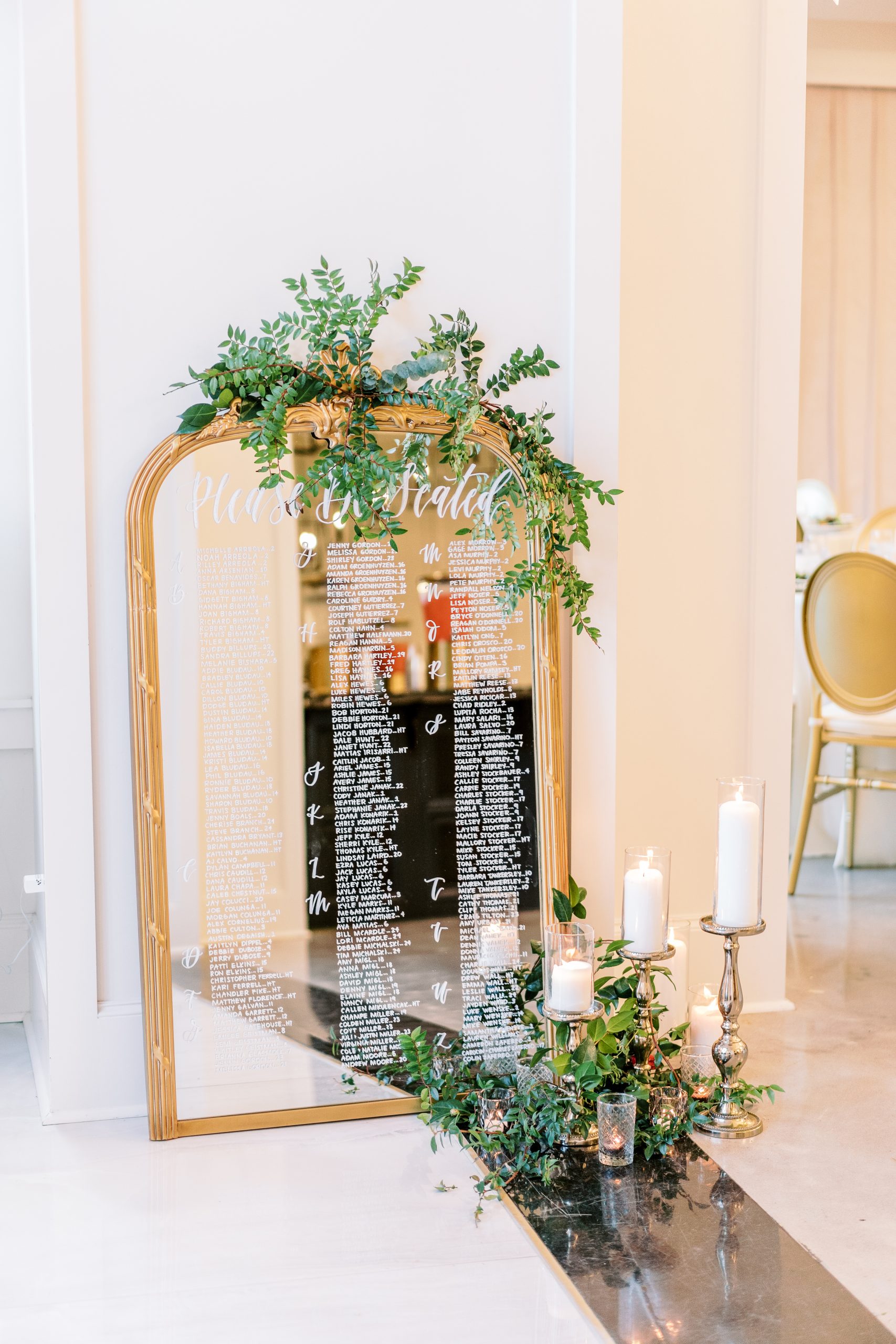
Photo: Alicia Yarrish Photography
Tip 4: Implement My Favorite “Secret Weapon”
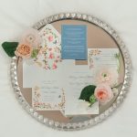
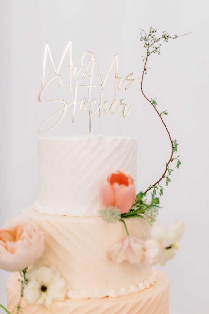
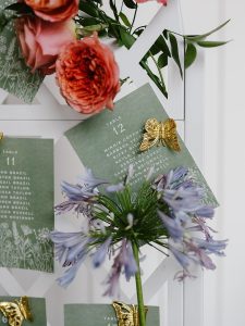
Speaking of subtle ways to create a cohesive wedding look, it’s time to introduce you to my favorite “secret weapon”… paper goods & signage. Whether you work with a custom stationery designer or a semi-custom site like Minted, a unified paper suite acts like the ribbon to tie up your cohesive wedding bow.
Most couples know the fonts, colors, and design of your invitations set the tone for your wedding day. But if you carry this over into the actual wedding through your signage and paper goods, you’ll instantly elevate your wedding look. I call this my “secret weapon” not only because of its subtlety, but also because of its accessibility. Regardless of budget, style, or formality level, choosing signage that matches your wedding vision is a simple way to create cohesion at your wedding.
Just some of the elements you can use to weave the spell of harmony are:
- Welcome Sign
- Ceremony Programs
- Bar Menu/Signature Cocktail Sign
- Seating Chart/Escort Cards/Place Cards
- Food Menu/Menu Sign/Buffet Cards
- Favors
Tip 5: Don’t Forget the Auxiliary Wedding Weekend Events
There has been a shift in the wedding world over the past few years toward multi-day celebrations. (Note: for many cultures, multi-day celebrations have been the norm for centuries.) For many couples this increases the challenge to not only create a cohesive wedding look, but a cohesive wedding weekend. While I could talk for days about great ways to tie in your auxiliary wedding weekend events with your wedding, I’ll speak to just three right now for quick take aways.
First, create a through line in your color palette. You do not need to have the same color palette for all of your events to create a unified wedding weekend. Instead, think about what you want the tone of each event to be so you can tweak your palette(s) to match.
It can be helpful to utilize the same creative partners for all of your auxiliary wedding weekend events. Not only does it simplify the logistics for you and your families, they also know your wedding day plan backwards and forwards and can support you in creating cohesion between all events. There may even be some elements you can reuse between days like your welcome sign or chair rentals.
Have you ever watched a movie and noticed “easter eggs”? Whether it’s seeing Pixar characters in movies they aren’t a part of or getting major foreshadowing for future Marvel movies, easter eggs are a great way to drum up excitement and cohesion over your wedding festivities. I love the idea of using mixology to tell a story over the weekend like having a specialty drink at your welcome party that teases the motif or “vibe” for the wedding the next day.
Regardless of your vision, if you select a strong color palette, remain consistent in formality level, lean on a motif, and implement my “secret weapon” you can create a cohesive wedding look you and your guests will talk about for years to come.
A HUGE thank you to Skylar Caitlin with Chancey Charm Weddings for sharing all the expert wedding advise! Find their Planner Tutorial and more in our Brides of Houston Fall/Winter 2022 issue, available here!
Other Local Vendors:
Chancey Charm Weddings, Alicia Yarrish Photography

